Better Tooltips
WARNING:
This information and code is presented to you in good faith. Using parts of this code or file is at your own risk. Amending code your code using the method below will enable the feature only in the current version that you are using. If you upgrade your Dolibarr version, then this code will be automatically erased (and the feature will be removed). Unless the feature below has been included in the core, you would need to apply this code again in your new version. Always backup the files mentioned before manually changing any code.
[tt]Tested on: 7.0.4[/tt]
[hr]
What this does
In recent versions of Dolibarr (maybe from around v6), the tooltips around the interface have removed to a bettter style and design. The suggested code in this post just improves on that and if applied, give you a different look and feel to your interface. This only applies to the default ‘edly’ theme.
Changes from the default tooltips
- Derived from the default tooltip fields with
classfortooltipcss class - Rounded borders for tooltip and contained images
- Centered contained images
- Slim black thin left bar to simulate tooltip as a badge or band
- Black text, even on links (as links are currently unclickable in the tooltip core)
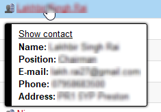
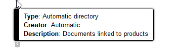
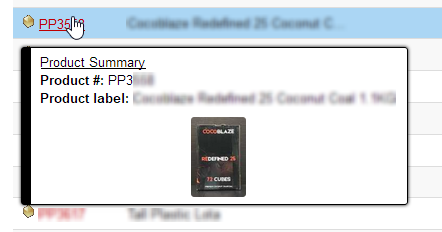
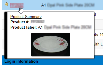
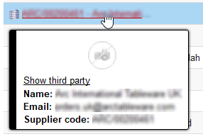
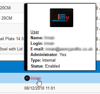
Examples
How to do it:
In file:
/theme/eldy/style.css.php
Replace section: [tt](around line 3403)[/tt]
.mytooltip {
	border-top: solid 1px #BBBBBB;
	border-<?php print $left; ?>: solid 1px #BBBBBB;
	border-<?php print $right; ?>: solid 1px #444444;
	border-bottom: solid 1px #444444;
	padding: 5px 20px;
	border-radius: 0;
	box-shadow: 0 0 4px grey;
	margin: 2px;
	font-stretch: condensed;
With:
/* BLACK TOOLTIP */
.ui-tooltip {
	border-top: solid 1px #000 !important;
	border-left: solid 10px #000 !important;
	border-right: solid 1px #000 !important;
	border-bottom: solid 1px #000 !important;
	padding: 5px 10px !important;
	color: #000 !important;
	border-radius: 3px !important;
	box-shadow: 0 0 3px #000 !important;
	margin: 2px !important;
}

/* BLACK TOOLTIP - BLACK TEXT */
.ui-tooltip-content {
	color: #000!important;
	border-radius: 3px !important;
}

/* BLACK TOOLTIP - IMAGE */
.ui-tooltip-content img {
	border-radius: 3px !important;
	display: block;
	margin-left: auto;
	margin-right: auto;
}

/* BLACK TOOLTIP - LINK IS NOT CLICKABLE SO NO NEED FOR DIFFERENT COLOR */
.ui-tooltip-content a {
	color: #000;
	padding-bottom: 5px;
}
Save Changes
- Save your changes to the file
[li]Logout first if you’re already logged in ► Close your browser ► Clear your browser cache. - Log in again to see the tooltips


