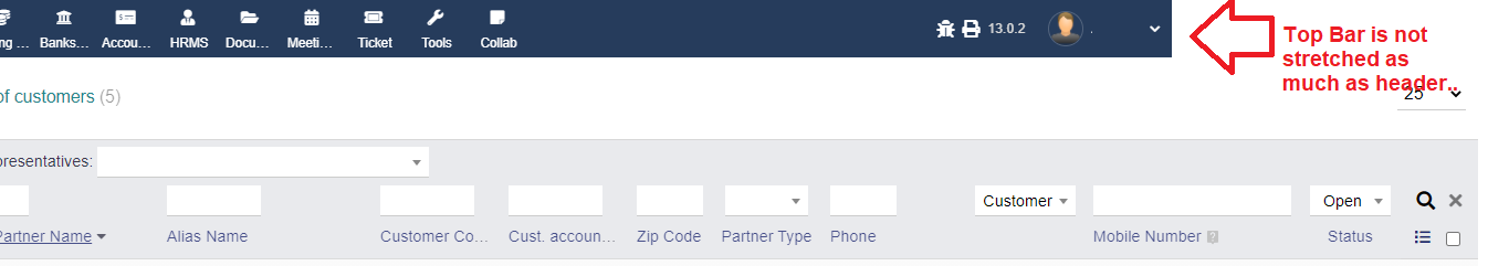
Why is the Top Menu bar is not getting stretched as much as body and the table header… Do we have any parameter to be changed for this … or any of you already faced the same issue and did some CSS changes…
Can you please help and point to that thread please…
Hello, I’m facing the same problem.
I guess the solution may be related to htdocs/theme/eldy/global.inc.php, but I’ve not solved this yet (.wrapcolumntitle or something…? I couldn’t figure out).
Thank you very much for the immediate reply. Here are the details:
What is your resolution ? - Standard Laptop resolution : 1366 x 768
What browser ? Google Chrome Version 90.0.4430.212 (64 bit)
You have it with different browsers ? Yes.
If you want that this toggling be PERMANENT (ex: once hidden maintain hidden in the next clicks along your navigation) then you will need to touch -for example- PHP SESSION in server side using PHP (is the easiest way, use SESSION to “semi-permanent” store this preferences during at least your current user session). But for implement it you need to implement an AJAX call from that hamburger icon to a PHP file on server.
The other way is set (using CSS on the eldy them) to have ALWAYS hidden that menu, and only show it when user click on menu icon. Then you will not need PHP, only CSS and javascript.
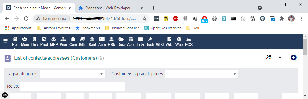
I was looking something like md menu. It has the hamburger icon and hides the left menu.
Would it be easier to just replicate something like that into eldy since most of the functions would have already got built it and would be compatible with future releases (14.0.0…?) as well…
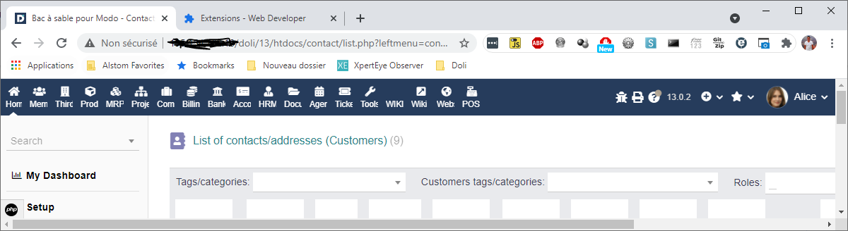
You face that issue because the content list to display is bigger than your screen resolution.
So you have a horizontal scroll bar.
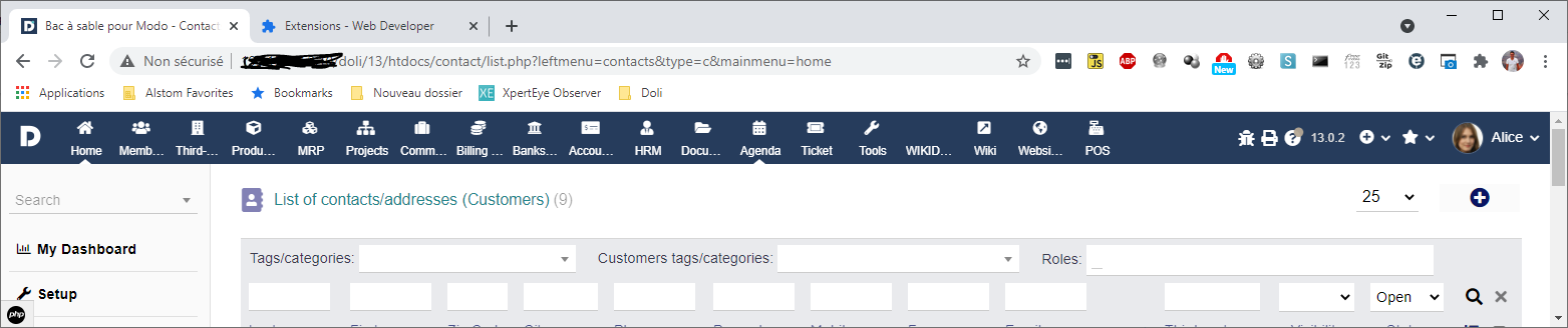
Then the top menu adapt to your screen without the scroll bar :